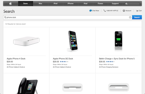
Apple Improves Online Store User Experience with New Touch-Friendly Menu Bar
Apple tweaked its online store during the night: starting Friday morning the store has become more touchscreen device friendly (via Macotakara).
The changes involve a new quickly scrollable menu bar for product categories. While the main page practically remains the same, when users select one of the four main categories, a navigation bar appears at the top of the page showing various products and related topics.

The topics can now be slid back and forth using finger gestures, while devices with non-touch screen can navigate between the products and topics using the arrows located at both ends of the scroll bar.

Another change that will pop-up if you browse through Apple’s online store is related to search results. If you’ve previously searched for a product, the results were presented as list of items. As of today, the results now appear in a grid formatted for touch devices, allowing easy access by tapping on the selected result.
The above tweaks definitely improve the user experience on both iPhone and iPad.

