An Analysis of Apple Maps and Google Maps Over the Past Year

Apple and Google are both working on their respective mapping applications constantly. Justin O’Beirne has posted an incredibly detailed analysis comparing Apple Maps and Google Maps.
“Coincidence or not, it was interesting. And it made me wonder what else would change, if we kept watching. Would Google keep adding detail? And would Apple, like Google, also start making changes?
So I wrote a script that takes monthly screenshots of Google and Apple Maps.1 And thirteen months later, we now have a year’s worth of images.”

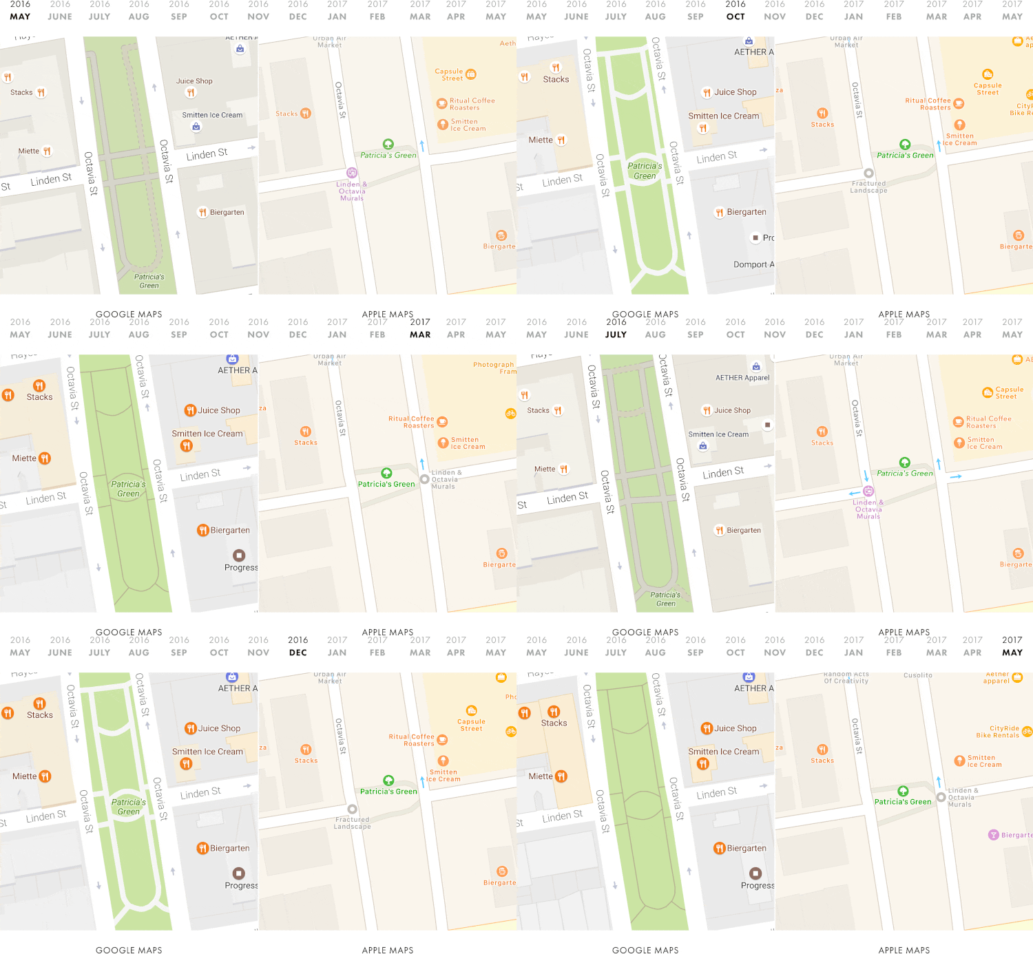
The screenshots in his post perfectly demonstrate how Google Maps has been considerably improved in many areas over the past year, while Apple Maps has remained essentially the same.
“Over the course of a year, Google quietly turned its map inside-out – transforming it from a road map into a place map.
A year ago, the roads were the most prominent part of the map – the thing you noticed first. Now, the places are.”
This isn’t to say that Apple Maps is bad. It is meant to show that Google simply has an edge in the collection of business information. With this large amount of information and infrastructure, the search giant is constantly evolving their location data at a significantly faster pace than Apple, which could in part be due to Google’s experience in the space.
We should see the next-generation of Maps updates at WWDC 2017, which could remove the dependence on TomTom data to accelerate the updates.
[via Justin O’Beirne]

