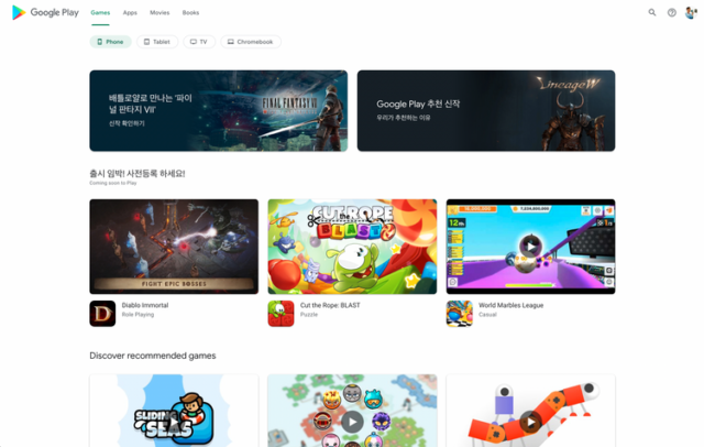
Google Play Store Website Getting Long-Overdue Redesign
The Google Play website is getting a long-overdue redesign.

Android Police
Even though the Play Store application for Android has gone through many design iterations over the years, the Play Store website has been frozen in time. For years, it has had the same early Material Design look, but that is finally changing.
According to a new report from Android Police, Google is currently testing a new Play Store site design in some regions, which seems like a substantial improvement from the current layout.
The rethink appear to scrap the large sidebar and cards in favor of a simple four-button navigation system and big, clean-looking listings with auto-playing trailers for games, and you can filter apps by device type. If you need to access your library or redeem a gift card, options like those have moved to the account switcher common to Google web apps.
It’s easy to notice that Google is essentially just bringing the tablet UI view of the Play Store and using that interface on the web. For example, looking at an individual app listing shows a rather massive app icon on the right. Then, all of the rest of the app’s information such as the name, rating, and the number of downloads is still on the left side of the page.
Overall, this looks like a step in the right direction for the Play Store website, without the usual handful of regressions that come with most redesigns. Here’s hoping Google rolls it out to everyone soon.

