Google Search for Mobile Gets a New Look
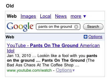
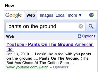
Looks like the Google mobile site has been updated again. The search box is bigger and it’s a lot easier to see your search term. Also, the search button has been moved to the side, so search suggestions don’t block the button anymore. I actually noticed this a couple days ago, but yesterday the Google Mobile blog made an official blog post explaining the details:
We’re always looking for ways to improve your user experience with our products. If you use Google Search with a web browser on your Android-powered device or iPhone, you’ll see some changes to the look of the buttons and toolbars to a style you may now be familiar with on Mobile Gmail, Latitude, Calendar and Tasks. As with these Google apps, the color contrast of the style now adds more focus to the search results of the page, and the header controls are bigger to make them easier to touch.
The Google logo has been moved up to the top of the search results page, allowing us to increase the width and height of the search box. You can now more easily touch the larger box to enter a new search, the new big bold font makes it easier to see what you have entered, and the wider box helps you see more characters at once.
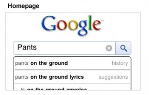
We have also given our homepage some love. While this got the bigger search box last month, we have created a new search button beside the search box rather than below, so when search suggestions appear, they no longer hide the button.
Check out the pictures below:
In addition to the announcement of Google Buzz, a new social networking initiative, the big G is definitely pumping on all cylinders. I love it when they release these mobile site improvements, like their constant updates to Gmail. Now if only my dreams of a native Gmail iPhone app would come true!
