Inside the Sketchbook of Susan Kare, Apple’s pioneering interface designer
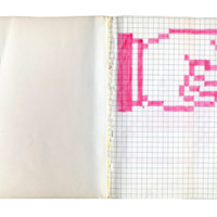
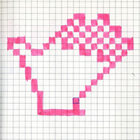
Susan Kare’s work is scattered throughout the classic Mac OS and still prevails in parts of OS X. In an article from PLoS some of her original Mac OS icons sketches are shown off. Here’s the back story:
Inspired by the collaborative intelligence of her fellow software designers, Kare stayed on at Apple to craft the navigational elements for Mac’s GUI. Because an application for designing icons on screen hadn’t been coded yet, she went to the University Art supply store in Palo Alto and picked up a $2.50 sketchbook so she could begin playing around with forms and ideas. In the pages of this sketchbook, which hardly anyone but Kare has seen before now*, she created the casual prototypes of a new, radically user-friendly face of computing – each square of graph paper representing a pixel on the screen.
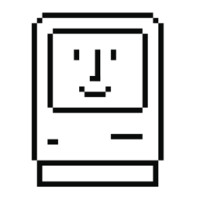
Many of the icons should be instantly recognizable to anyone who’s used a computer:
The article is full of gems. One that stood out is that the command key featured on every Apple keyboard is a stylized castle as seen from above. Apparently the image was commonly used in Swedish campgrounds to denote an interesting sightseeing destination.
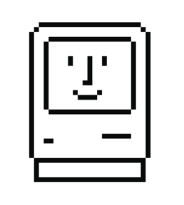 Also for the Mac, Kare designed the first proportionally spaced digital font family. Steve Jobs famously spoke about creating the Macs proportionally spaced font at his 2005 Standford Commencement Speech.
Kare’s work extends beyond the Mac world, with her creations appearing in Windows and on Facebook, where she designed the “Gifts” icons. A book has just been published telling the story behind her work and explains where the idea of the “Happy Mac” icon came from.

