
Microsoft 365 Support to End on Older Macs and iPhones Starting in July
Microsoft is ending core support of Microsoft 365, Office 2019, and Office 2021 on older Macs and iPhones, starting July 13th.
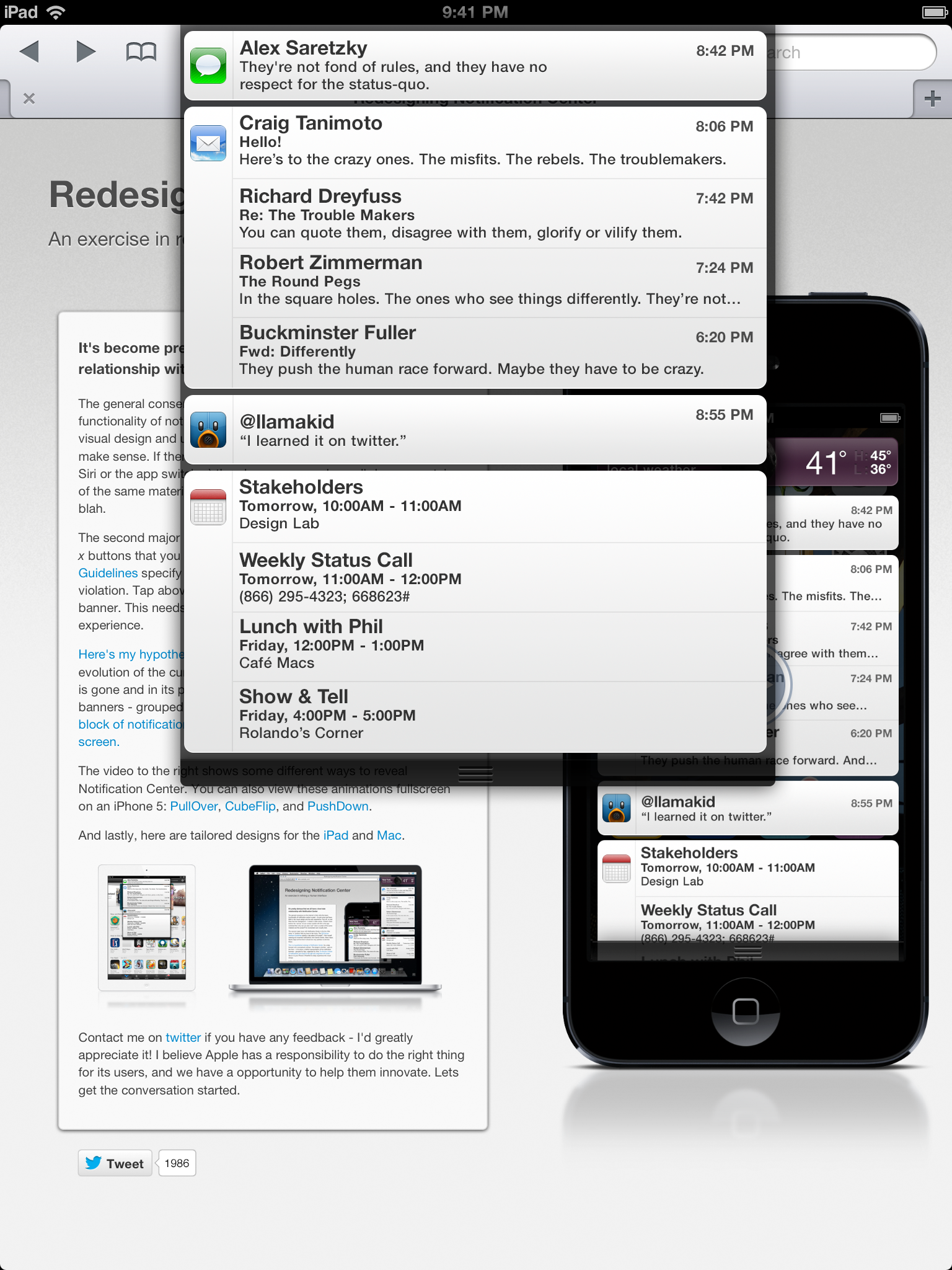
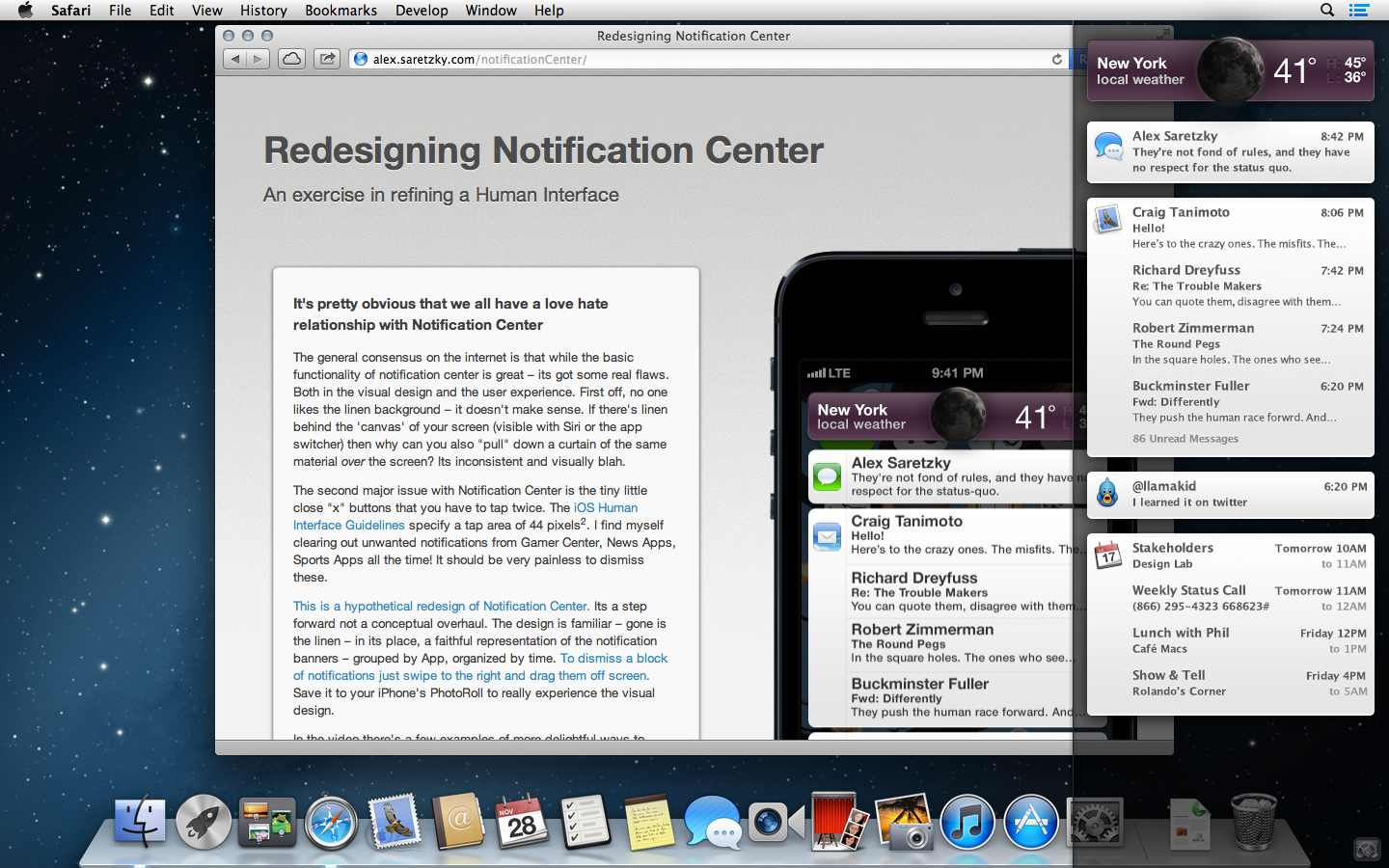
Developer Alex Saretzky has published a hypothetical redesign of the Notification Center for iOS and OS X, replacing those annoying ‘x’ close buttons with blocks of notifications that can be dismissed by a swipe to the right or by dragging them off screen (via The Loop). The concept also shows some animation ideas to reveal the Notification Center.

The designer has improved both the visual design and user experience of the current Notification Center. He has replaced the linen background with a representation of the notification banners grouped by app, organized chronologically. Similar concept has been tailored for the iPad and Mac.
Here’s what he says:
No one likes the linen – it doesn’t make sense. If there’s linen behind the screen (seen when you use Siri or the app switcher) then how can you also pull down a curtain of the same material over the screen? Its inconsistent and visually blah.
The second major issue with Notification Center is the tiny little close x buttons that you have to tap twice. The iOS Human Interface Guidelines specify a tap area of 44 pixels2, these are clearly in violation. Tap above or below the x and you’ll hit a notification banner. This needs to be painless and really should be a delightful experience.
You can visit his blog and watch the video showing different ways to reveal Notification Center i.e PullOver, CubeFlip, and PushDown. Don’t forget to tell us what you think of this brilliant concept.
Want to see more of our stories on Google?
P.S. Want to keep this site truly independent? Support us by buying us a beer, treating us to a coffee, or shopping through Amazon here. Links in this post are affiliate links, so we earn a tiny commission at no charge to you. Thanks for supporting independent Canadian media!


Just like Android.
Not that I care…it’s better and shouldn’t be something you can patent. I miss this since switching to iPhone.
Swipe to clear notifications?? you mean just like android has always done?? WOW INNOVATION!
So copying the way android notifications work is called a concept? Good to know.