Multitasking Redesign – A New iOS App Switcher Concept [VIDEO]

We’ve already seen a number of app switcher concepts in the past few months and today, yet another one of those multitasking/app switcher concepts has hit the web. According to the concept designer, there is a big difference between app switching and multitasking, and Apple’s implementation is closer to the former i.e there are limited ways in which you can truly ‘multitask’.
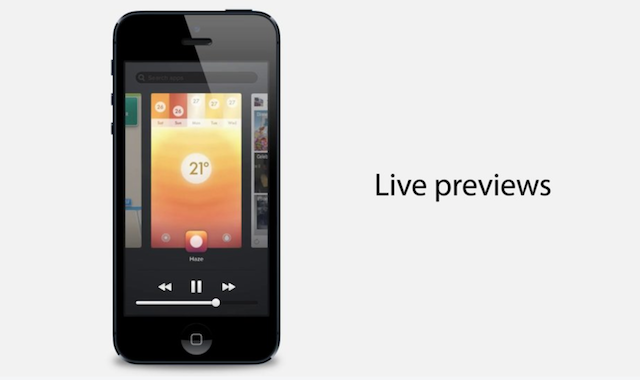
iOS currently supports one ‘active’ app on the screen at any given time. Switching to a different app gives it the ‘active’ status, replacing the content that previously filled the screen. The developer states that true multitasking has some significant differences/advantages as compared to simple app switching. In this concept, double tapping the home button takes you to the switcher, where you are able to switch between apps in a manner similar to an iPad. Further, it allows for prime positioning of the toggles, brightness and music controls.
“The benefits of such a system are seen in the switcher concept video, where the user is able to switch between the Mail, Haze and Flipboard apps, whilst watching them update live. There are more benefits then simply live updates however. For example, the combination of full app previews, the large icon and name presented underneath each app, make it much more obvious which app you’re switching to, and prepares you for what to expect when revisiting that app”.
Check out the multitasking concept video and share your feedback on the design in the comments section below.
Want to see more of our stories on Google?

P.S. Want to keep this site truly independent? Support us by buying us a beer, treating us to a coffee, or shopping through Amazon here. Links in this post are affiliate links, so we earn a tiny commission at no charge to you. Thanks for supporting independent Canadian media!


Stolen from Webos
webos copied it from apple!
Cards… and swipe them away … love it tho … just wish Palm could have taken Webos where it needed to go cause HP sure didnt