Check Out This Cool “WhatsApp For iOS 7” Design Concept
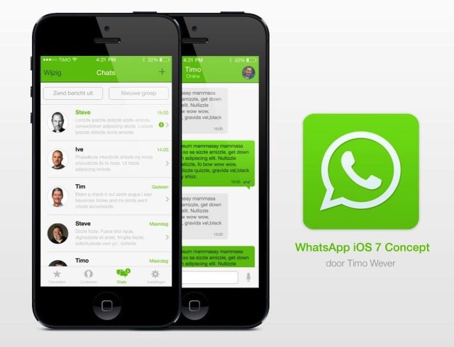
Following iOS 7’s new design guidelines and thinner Helvetica fonts, web designer Timo Wever has come up with a decent “WhatsApp for iOS 7” design concept. While some of the other apps, including Facebook for iOS, have already received a design overhaul to match the iOS 7’s flatter design, the most popular cross-platform messaging service is still continuing to use its old icon and design (via Cult Of Mac).

While we hope the developers behind WhatsApp are working hard to introduce a new, updated design for the app, lets take a look at these cool “WhatsApp for iOS 7” concept designs that give us a hint of what might be in store for the most popular messaging app ever. The concept features thinner Helvetica fonts, words where there were previously buttons, and clean, minimalistic tabs and icons. The design is also significantly more greener than the existing WhatsApp design.
I personally like the new design better than the current one, though the green colour could be tweaked a little bit, may be a notch darker perhaps. Otherwise, the flatter look, circular display pics and thinner fonts would go so much better with iOS 7.
What do you think of this design?

