Google Updates Hangouts for iOS With New User Interface and Design
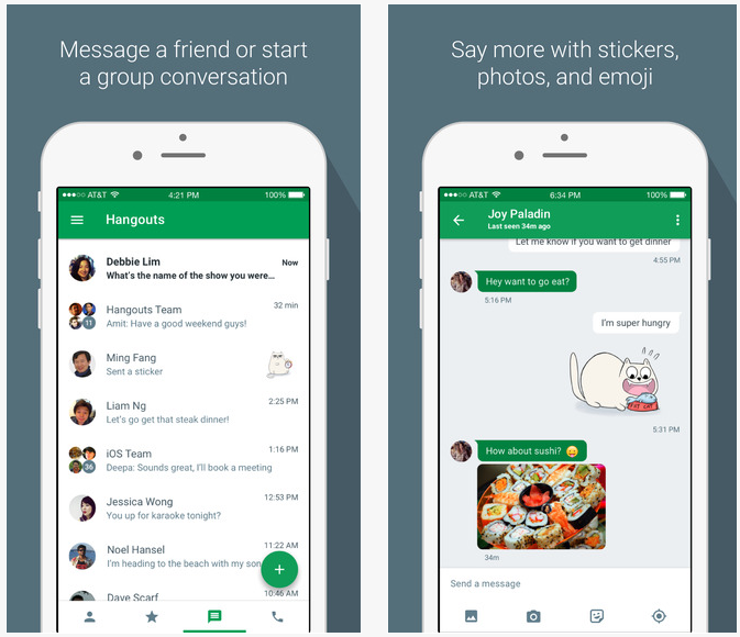
Today, Google has shipped an update for their Hangouts application on iOS that brings a new design to the entire application.

Even though this is an iOS application, it feels like an Android application because it follows the same Material Design principles that Google’s Android applications use. The main screen of the application only receives a few changes, including a new circular button for starting a new conversation and a navigation drawer which can be accessed by using the hamburger button on the top left.
In addition to the new forms of navigation, there are a few subtle tweaks included in the update. The fonts now use a thicker weight and have a blue color as opposed to the light grey previously used.

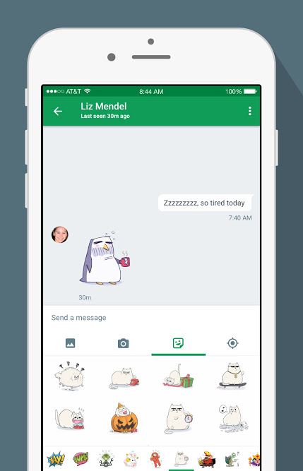
Once you start a conversation you will notice that Google has been doing a lot of work to update the appearance and usability of the app. The green color of the chat bubbles now fits with the green color that hangouts uses, and the green bubbles are the ones sent to you rather than by you.
Hangouts 4.0 for iOS is available as a free download from the App Store. The app requires any device running iOS 8.0 or later and has been optimized for the iPhone 5, 6, and 6 Plus. Google has yet to release the new interface for Android, however, recent leaks have pointed to a similar looking redesign on Android and Google says it will be coming soon.

