Apple changed the font on its website to use its San Francisco font, moving away from its Myriad Set (via Daring Fireball). The new font is now the basis for macOS, iOS, watchOS and tvOS.
Take a look a the quick comparison image of the changes we made below:
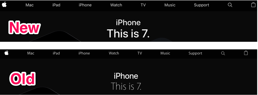
Apple debuted the San Francisco font with Apple Watch in 2015, and since then it has made its way to the back of the iPhone 7 and even the keys on the 2016 MacBook Pro.
John Gruber from Daring Fireball said back in September, “When we look back decades from now, I think we’ll see Myriad as Apple’s Jobs-era typeface, and San Francisco as their Cook-era typeface. For this reason, even though I very much like San Francisco, I find it a little melancholy to watch their use of Myriad fade away.”
When iOS 9 debuted, it also adopted San Francisco, replacing Helvetica Neue, which was created in 1957 in Switzerland, a time when digital devices were pretty much non-existent. San Francisco is a clearer font for today’s various devices and screen sizes, as is it optimized dynamically, with systems changing display and text fonts based on text size.
This post on Medium discusses more about the new font in detail, while this video from WWDC 2015, Session 804, has Apple Type Designer Antonio Cavedoni, introduce the new San Francisco system fonts.



I much prefer the Myraid typeface.
I agree. The old one looks better imo