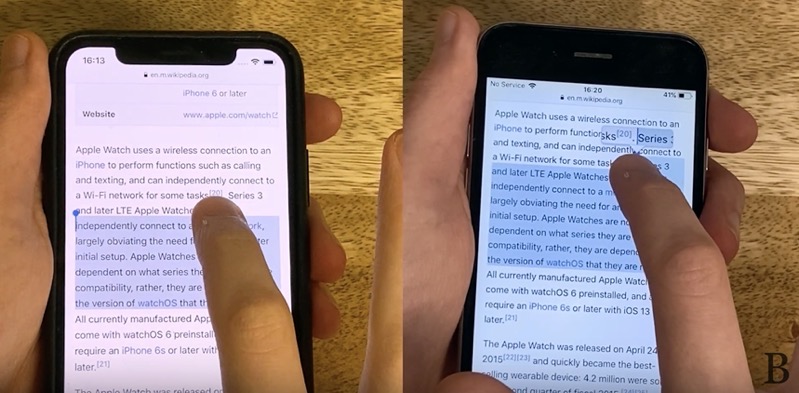
Highlighting Text in iOS 13 is Terrible vs iOS 12 [VIDEO]

Benjamin Mayo (from 9to5Mac) has released a video detailing what we’re all thinking about text selection in iOS 13 on iPhone and iPad compared to iOS 12: it’s terrible.
Mayo refers to WWDC 2019, when Apple executive Craig Federighi lauded the new method for selecting text in iOS 13, saying “there’s no need to double tap and no magnifying glass getting in your way”. Mayo’s reaction:
I remember doing a double-take when he said it because that’s not really true at all. The magnifying glass was a convenience, rather than annoyance. Getting rid of it sounded like it would be exactly the wrong thing to do, especially as there was no alternative UI affordance to fulfil its purpose.
With the final release of iOS 13, Apple’s text selection is terrible compared to iOS 12. Mayo has a video comparing the changes. The worst part is trying to select text all the way to the outer edge of an iPhone. It’s next to impossible. I hope Apple brings back the old magnifying glass for selecting text. It was much easier and helpful compared to not knowing what you’re selecting with your finger.
What do you prefer? The text highlight in iOS 13 or iOS 12?


