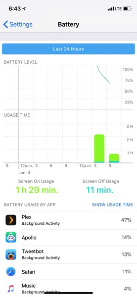
This is the New iPhone Battery Usage Graph in iOS 12 [PIC]
In iOS 12, Apple has continued where it left off in iOS 11, to bring forth more battery information for iPhone and iPad users.
One new addition is a new graph in Settings, which according to Apple, “now shows your usage for the last 24 hours or 10 days.” Users can “tap a bar to see your app use for that period of time.”
Here’s a pic of the new iOS 12 battery chart in action, as shared by iPhone in Canada reader shinratdr:

As you can see, the graph shows what time your battery was at 100%, then a trickle as your day goes on. Below the battery level graph is a chart for ‘usage time’, which details your screen on and screen off device usage. Below that is a list of apps which are currently using the most out of your battery.
With iOS 11.3 from earlier this year, Apple debuted a new Battery Health feature, which explains to a customer if their device battery needs to be replaced, while also detailing the maximum capacities of batteries “relative to when it was new.”

