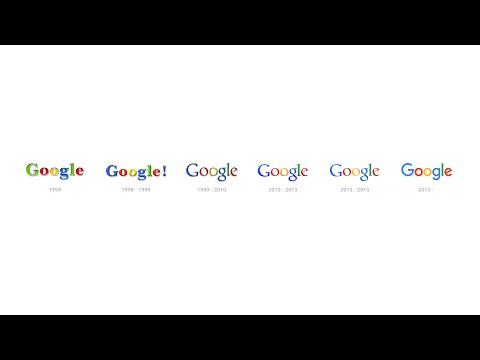
Google has just unleashed a new logo for the first time in 17 years, to help adopt the logo for smaller screens and devices:
Today we’re introducing a new logo and identity family that reflects this reality and shows you when the Google magic is working for you, even on the tiniest screens. As you’ll see, we’ve taken the Google logo and branding, which were originally built for a single desktop browser page, and updated them for a world of seamless computing across an endless number of devices and different kinds of inputs (such as tap, type and talk).
Below is what the new logo looks like:

Google goes into deeper detail on how they created their new logo on their design blog:
Our new logotype is set in a custom, geometric sans-serif typeface and maintains the multi-colored playfulness and rotated ‘e’ of our previous mark—a reminder that we’ll always be a bit unconventional.
What do you think of this new Google logo?


Hate the font
I went over to google dot ca and its pritty awesome how they introduce the new logo. Creative. I liked that. As for the logo, doesn’t effect my life, I don’t care.