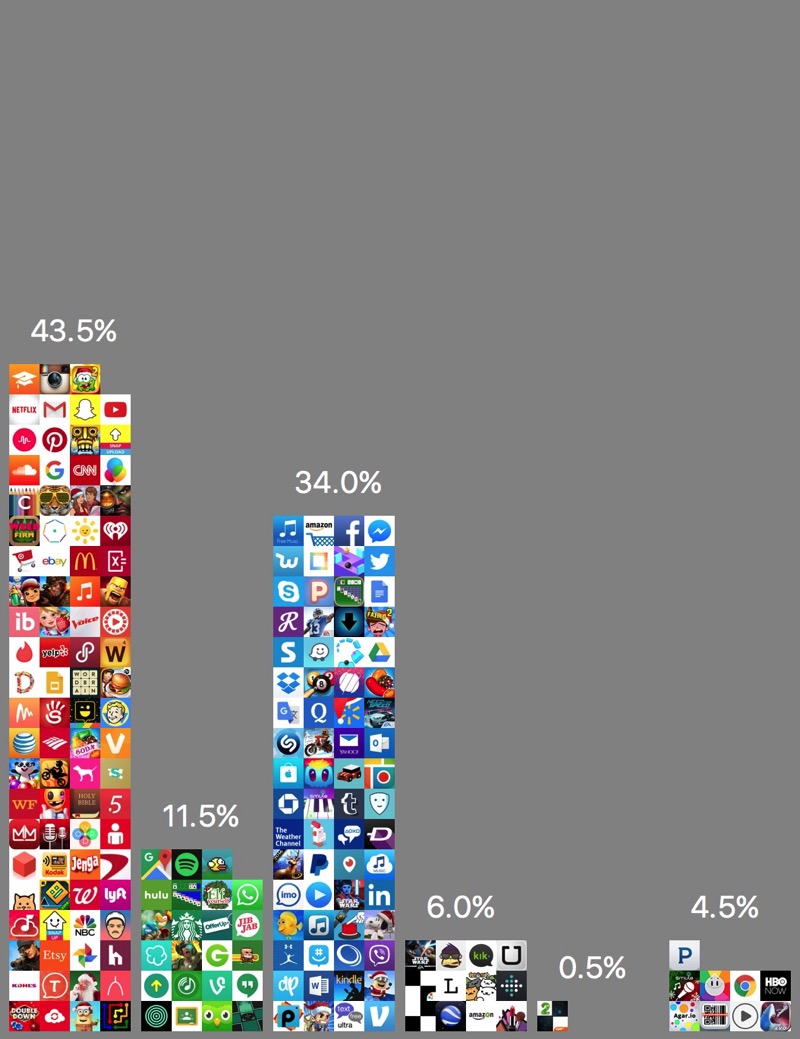
iOS App Icons in 2015 Organized by Colour [PIC]
Hwee-Boon Yar examined the colours of iOS app icons for 2015—here’s how he did it:
I wrote a couple of Ruby scripts and pulled charts from the iOS US app store using RSS feeds from Apple, downloaded the icons and extracted the primary colors used in each icon. I then wrote a Mac app to generate the numbers, charts and tables. The Newsstand category includes apps from several charts and did not have a separate paid app chart so while I have included the data for completeness sake, I wouldn’t be looking at it.
I extract the primary color from each icon and put them loosely into one of these color groups: red, green, blue, black, white and gray. If they are identified as black, white and gray, I look at their secondary color and try to place them into red, green, blue instead where possible (e.g a small, single blue letter on a white background might work better if it’s classified as blue instead of white).
The app icons for each chart are then stacked vertically. The taller a column is, the more commonly that color is used for icons in that chart.
Data was pulled from the App Store between December 16-22. Below is one image of the icons from the Top 200 Free Apps in the iOS App Store categorized into red, green, blue, black, white, grey:

As you can see, red and blue are the most popular, followed by green, black. More extensive data can be seen here on Hwee-Boon’s site.
Remember the Twitter client SimplyTweet? That was created by Hwee-Boon. I had the chance to meet up with him a couple times during recent visits to Singapore—he’s a super cool dude.
If you’re a developer, you need his latest app, Iconica+. It’s one of the easiest ways to test your new app icon on an iOS device to see how it looks.
Want to see more of our stories on Google?

P.S. Want to keep this site truly independent? Support us by buying us a beer, treating us to a coffee, or shopping through Amazon here. Links in this post are affiliate links, so we earn a tiny commission at no charge to you. Thanks for supporting independent Canadian media!

