Twitter Redesign Doesn’t Meet Accessibility Standards, Say Experts

Image: Twitter
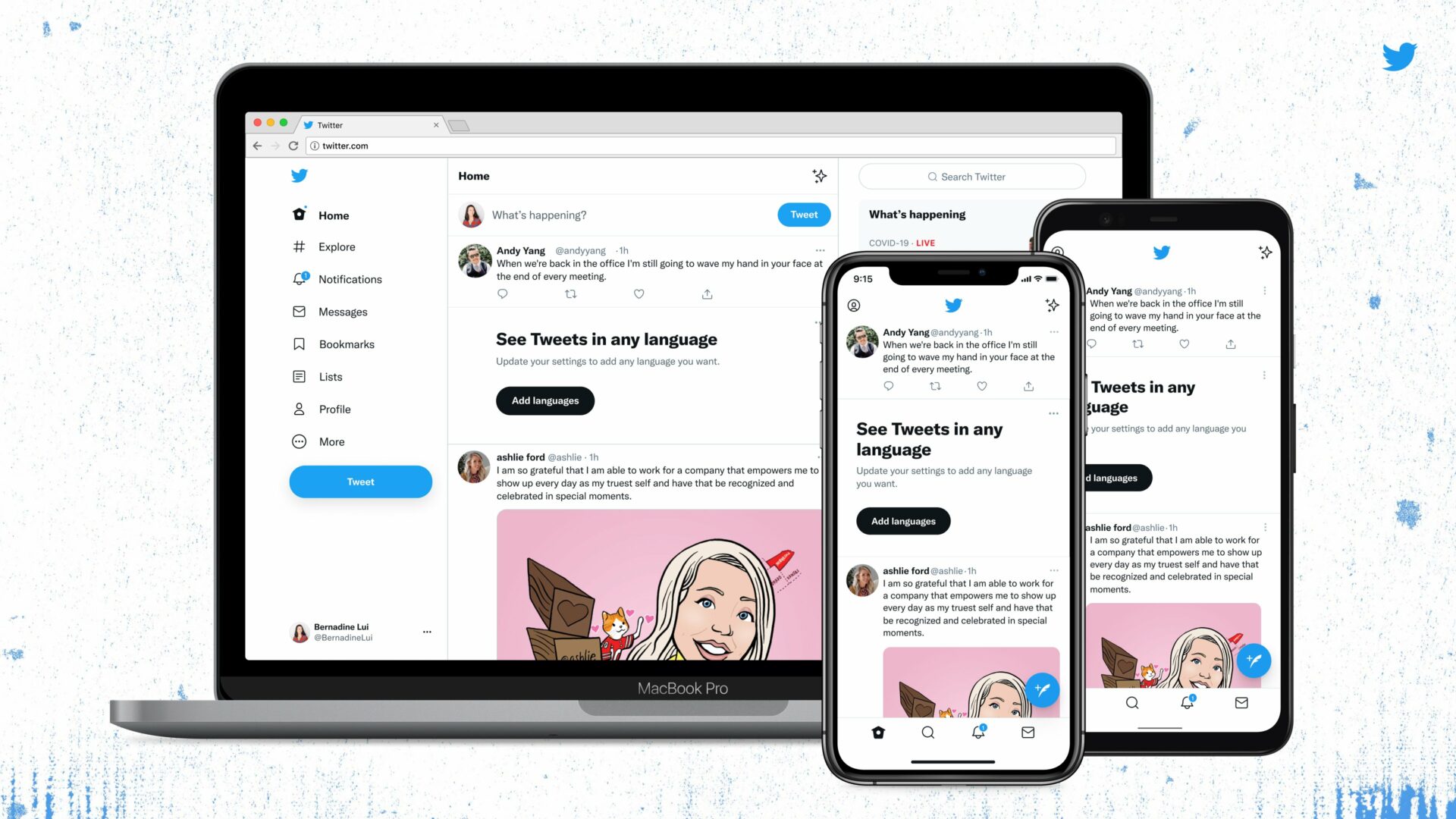
Earlier this week, Twitter started rolling out a major design update for both its app and web interface, complete with its new font ‘Chirp’, higher visual contrast between text and the background, higher-contrast User Interface (UI) elements, and less clutter.
Notice anything different?
Today, we released a few changes to the way Twitter looks on the web and on your phone. While it might feel weird at first, these updates make us more accessible, unique, and focused on you and what you’re talking about.
Let’s take a deeper look. 🧵 pic.twitter.com/vCUomsgCNA
— Twitter Design (@TwitterDesign) August 11, 2021
Twitter says the changes are designed to make the user experience “more accessible”, but some experts are saying Twitter has failed to meet widely-accepted accessibility standards for the web and mobile apps — reports TechCrunch.
For starters, users are reporting that Chirp is more difficult to read than Helvetica, which Twitter previously used before creating its own typeface.
Higher visual contrast is beneficial for people with low vision, but can also cause eye strain for some users and headaches for those prone to migraines. Individuals with reading/learning disabilities are also known to work better with lower contrast.
Twitter more than meets the minimum contrast standards set by the Web Content Accessibility Guidelines (WCAG), but the platform failed to factor in the one thing they marketed as the focus of the redesign: accessibility. The refresh provides no options for users to personalize visual contrast and/or saturation on the website or app, which is a shame since every individual has a different ‘contrast sweet spot’.
“They talked a good talk about how they were going to [include disabled people in design decisions from the beginning], that they were going to integrate accessibility and disabled perspectives more into their design processes, and from this, it seems they have not done an adequate job with that,” said Alex Haagaard, a design researcher and founding member of The Disabled List.
“Engaging people from disabled communities as consultants at the high-level stages, within the research and conceptualization phase, would prevent designers from getting to a point where you’re testing something and you realize it’s fundamentally problematic and it’s too late.”
On the official Twitter Accessibility account (@TwitterA11y), Twitter acknowledged the issues users were experiencing, and encouraged them to keep the feedback coming.
We are seeing some display bugs, so if you encounter those please send us a screenshot. This will help us troubleshoot the issues.
Also, if you continue to experience painful eye strain or headaches/migraines because of the font, please check-in with us again.
— Twitter Accessibility (@TwitterA11y) August 12, 2021
In the meantime, Twitter has at least toned down visual contrast on UI elements to make the redesign “easier on the eyes“, and confirmed that the platform is “listening and iterating”.

