Roku Testing New Home Screen, Bringing New UI to Users

Roku is testing a new home screen for its players after years of making only minor tweaks. These tests have been hitting select users over the past weekend, introducing a new UI on their players.
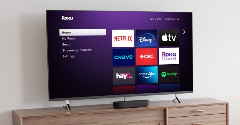
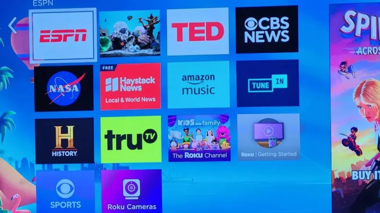
Since the introduction of Roku’s current UI, the company has only made minor tweaks to performance and useability. As of now, Roku players offer a simple 3×3 app layout. This includes tiles for many popular streaming services, Roku Channel, and more. However, according to some users, a new 4×4 layout is being tested.
News of the revamped layout comes from Cord Cutters News, who first discovered a Reddit post showing off the new UI. The post explains that the user’s Roku player was displaying a new 4×4 layout, much to the surprise of the user.

Source: Reddit (u/mauryandnasty)
Understandably, users weren’t able to figure out why the 4×4 layout appeared nor how to replicate it on their own devices. Cord Cutters News has since confirmed with Roku that the new layout is being tested for the time being.
The new UI not only refreshes Roku’s home screen. It also gives users more apps to access without having to scroll or navigate other menus. Rather than nine apps, users will have access to 16 apps.
Roku’s last OS update was in April. With new players expected to ship this fall, we may see a rollout of new software features later this year. Of course, just because the new layout is being tested doesn’t mean its guaranteed to have a wider release down the road. However, it’s a good sign that indicates Roku may be looking at new options to spruce up the home screen.

