
Disney+ App Gets New Logo Colour, Splash Screen

Disney+ recently unveiled a new app logo colour and it’s making everyone do a double-take.
The colour has shifted from its previous deep blue to a more teal colour. Here’s what it looked like before:

The new logo went live last week and it’s on iPhone, iPad and Apple TV and more. There’s also a new splash screen start up as well with a new animation, to go with the new colours in the background:
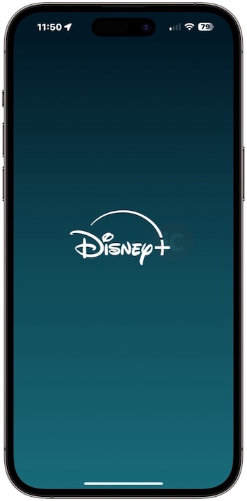
The new app icon colour is also showing up for the Disney+ app on smart TVs as well.
Personally, I liked the old blue colour better. This new colour feels bland but it does make the app icon stand out more versus other competitors. Paramount+ is blue, Crave is blue and so is Prime Video.
So what’s up with the colour change? Well, Reddit sleuths have discovered this new colour is a mixture of the old Disney+ blue and the Hulu green colours, ahead of both apps merging this month in the U.S. (bless you, internet).
What do you think of this new Disney+ app icon colour?
