Google Maps Adds COVID-19 Overlay With Infection Trends
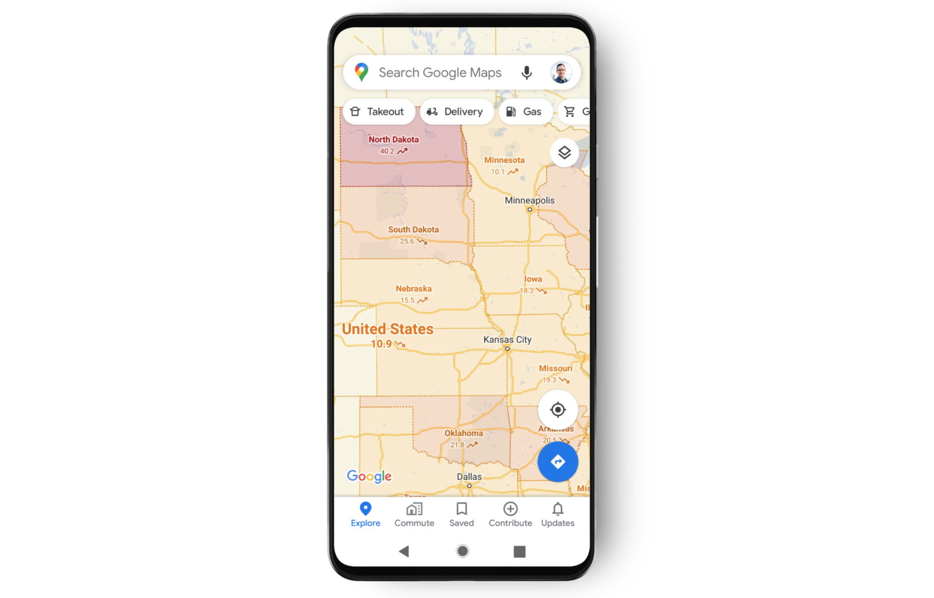
Google has added a “COVID layer” to the Maps platform, granting users up-to-date information on infection trends across state and city.

According to a new Google blog post, the COVID-19 layer will show information for all 220 countries and territories that Google Maps supports, along with state or province, county, and city-level data where available.
Trending case data will be visible at the country level for all 220 countries and territories that Google Maps supports, along with state, province, county and city-level data where available.
Information included in the COVID-19 layer will be sourced from “multiple authoritative sources,” such as Johns Hopkins, The New York Times, and Wikipedia. These sources, in turn, get data from public health organizations, including the World Health Organization.
According to Sujoy Banerjee, Product Manager of Google Maps, each of these sources get their data from public health organisations such as the World Health Organization, government health ministries, and state and local health agencies and hospitals.
Banerjee says users will be able to access the data layer through a new top right-hand corner tab called “COVID-19 info.” You will then see a seven-day average of new COVID-19 cases per 100,000 people for the area you are looking at in Maps. Labels indicate whether or not caseloads are increasing or decreasing.
“While getting around is more complicated these days, our hope is that these Google Maps features will help you get where you need to be as safely and efficiently as possible,” Banerjee said. “The Covid-19 layer starts rolling out worldwide on Android and iOS this week.”
Want to see more of our stories on Google?

P.S. Want to keep this site truly independent? Support us by buying us a beer, treating us to a coffee, or shopping through Amazon here. Links in this post are affiliate links, so we earn a tiny commission at no charge to you. Thanks for supporting independent Canadian media!

