Uber Rebrands Itself With New App Icon and New Logo
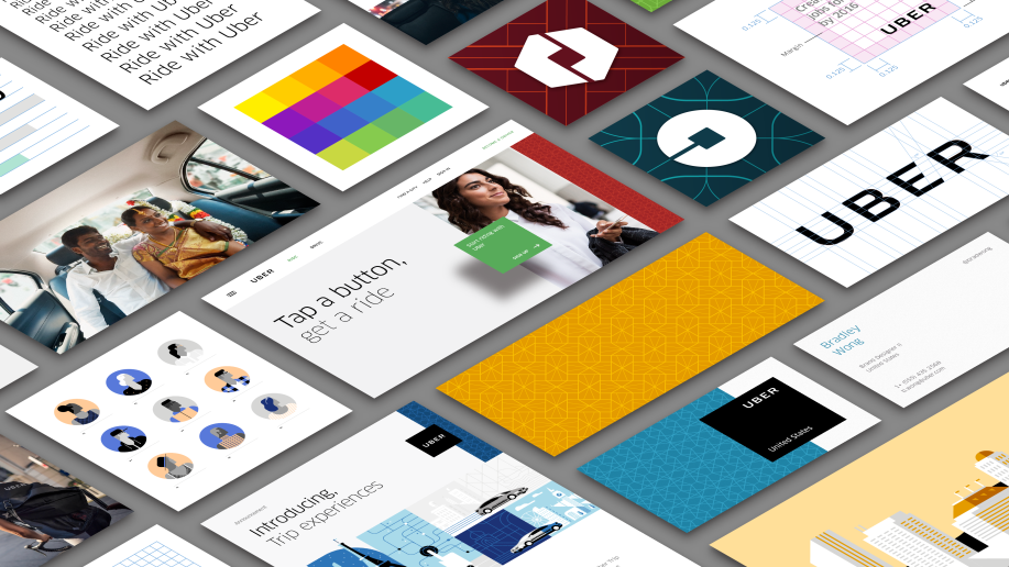
Today, Uber unveiled its redesigned branding and app logos in a blog post with an accompanying piece on Wired about the behind-the-scenes work to craft the new look.
First among the change is the Uber logo itself, which is now bolder, tighter, and a little more rounded. While many users probably won’t notice that change, they will notice the new app icons, which are drastically different from the previous iteration.
The ride-sharing company ditched its plain U-shaped logo in favour of a new futuristic design for its current apps. The logo change comes at a time when Uber’s valuation continues to skyrocket, most recently to $62 billion, and its ambitions drive it into countries and product categories. In the blog post, Uber’s CEO and cofounder Travis Kalanick said:
“Have you ever looked at someone’s hairstyle and thought “oh my, you peaked in the 1990s?” Well that’s a bit how I feel about Uber’s look today.”
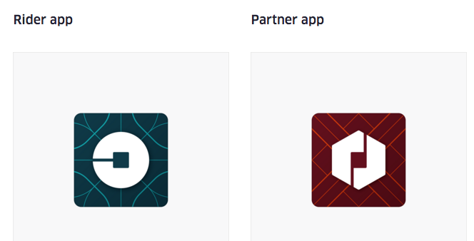
In the app that customers see, there is a single line representing the passenger’s journey in the Uber car. In the version of the app for drivers, there are two lines, representing the process of picking up and dropping off passengers at multiple points.
The new icons are much brighter with designs heavy on abstraction. Drivers will see a red app with sharp patterns, and riders will see a greenish-blue app with smooth, rounded patterns.
The background colours will eventually be customized for every country Uber operates in as well.
Uber’s tagline has also changed, from “Everyone’s private driver” to “Get there.” In the blog post, Kalanick said that they changed their branding and logo to celebrate the cities that they operate in.
“Uber started out as everyone’s private driver. Today we aspire to make transportation as reliable as running water, everywhere and for everyone. Our new brand reflects that reality by working to celebrate the cities that Uber serves.”
What do you think of Uber’s rebranding with their new app icon and logo? Let us know in the comments below.
Want to see more of our stories on Google?

P.S. Want to keep this site truly independent? Support us by buying us a beer, treating us to a coffee, or shopping through Amazon here. Links in this post are affiliate links, so we earn a tiny commission at no charge to you. Thanks for supporting independent Canadian media!


