Here’s a Side-by-Side Comparison of macOS Catalina and Big Sur [PICS]
Developer Andrew Denty has just shared an interesting visual comparison of macOS Catalina and Big Sur, revealing some dramatic UI changes between the two releases. “I wanted to make sure my team was ahead of any coming changes as we were burned by changes in last year’s release of Catalina,” says Denty.
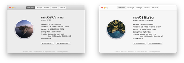
The first thing you notice after installing macOS Big Sur is a more colourful UI with bright, slightly more cartoonish iOS shaped icons. And as Denty points out, even though the icons are based around the capsule shape, many of them have elements that protrude from them giving an extra feeling of depth.


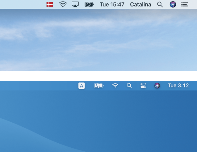
Menu Bar and Notification Center are some of the areas where macOS has changed the most. The Control Center is also a massive improvement on Catalina’s row of scattered Menu bar icons.
“The updated WiFi menu is also a massive improvement, as the old list could easily be overwhelming with the number of WiFi networks displayed.
I’m less convinced that the Notification Center is easier to use though. Now it has no background, there is less to separate a list of notifications from my messy desktop!”
Check out the source page for tons of side-by-side comparison screenshots and share your thoughts with us in the comments section. To find out whether your Mac supports macOS Big Sur or not, click here.
