Google Announces Major Android Rebranding with Updated Logo
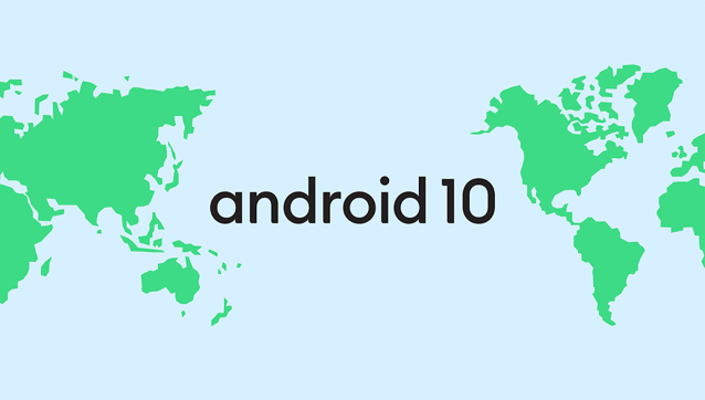
Google has today announced a massive Android rebranding with an updated logo while also changing the way it names its OS releases every year. With the public release of Android Q coming later this year, Google has said that instead of giving it a tasty treat or a dessert name, it will simply be calling it ‘Android 10.’

The company says its new Android logo draws inspiration from “the most recognizable non-human member of the community, the Android robot.” The robot has long been a symbol of Android which is why Google says it has “a special place in our logo.”

Google has also changed the logo text from green to black because “green was hard to read for people with visual impairments.”
As a global operating system, it’s important that these names are clear and relatable for everyone in the world. So, this next release of Android will simply use the version number and be called Android 10. We think this change helps make release names simpler and more intuitive for our global community. And while there were many tempting “Q” desserts out there, we think that at version 10 and 2.5 billion active devices, it was time to make this change.
Google will officially start using the updated logo in the coming weeks with the final release of Android 10.

