Redesigned LinkedIn Website Makes it Easier to Connect with People
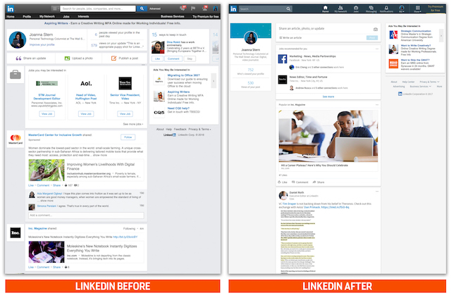
The Microsoft-owned professional social network LinkedIn has started rolling out a much needed redesign of its desktop site, making it easier to read posts and connect with people helpful to your career. According to The Wall Street Journal, the new website’s streamlined features give it a similar look and feel to its much improved mobile app, which was overhauled back in 2015.

Majority of users will see the new LinkedIn website immediately, while for some it may take a few weeks. The main home page is no longer cluttered with ads and promotional boxes. Instead, you see a cleaner Facebook-like feed of posts, and a search bar with the main shortcuts along the top. At the same time, LinkedIn has also tweaked its software and added more human editors to improve what it thinks you’ll be interested in.
It’s now also easier to have real-time conversations, with the new messaging interface that appears in the bottom right corner of the site, no matter which page you’re on.
“LinkedIn still litters the place with small, annoying banners that boast you can see the “500 people who viewed your profile,” only to take you to a page urging you to sign up for its premium service. Premium plans start at $25 a month and include lots of useful features, like online video courses, better access to recruiters and job salary information”.
So if you are looking for a job or want to make new business connections, the best thing you can do is update your profile on the all new LinkedIn website.

