Skype Redesign Focuses on Simplicity, Drops Snapchat-Like Feature
Skype has dropped a feature similar to Snapchat and Instagram’s “Story” highlight reels, in a back-to-basics redesign/update prioritizing “simplicity.”

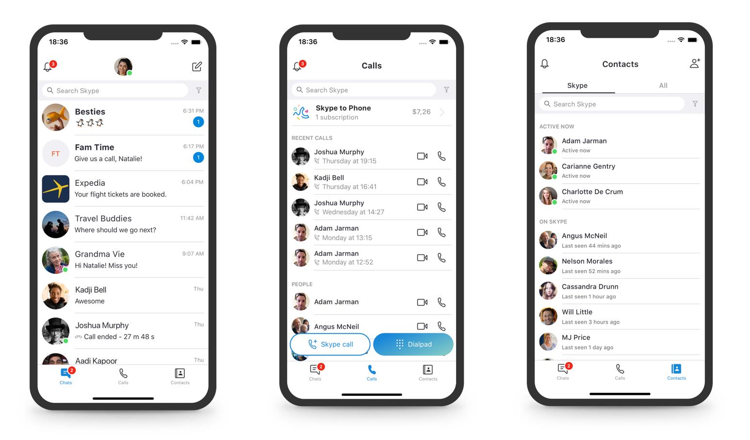
According to a blog post, the Microsoft-owned messaging and video-calling service said it was shaping up the Skype mobile and desktop apps to make it easier for users to navigate and find contacts — and that includes ditching its “Highlights” feature.
“This past year we explored some design changes and heard from customers that we overcomplicated some of our core scenarios,” Peter Skillman, director of design for Skype and Outlook, said in a blog post. “Calling became harder to execute and ‘Highlights’ didn’t resonate with a majority of users.”
Skype’s designers are now focusing on the main reasons people use Skype, including making voice and video calls and sending messages.
With the latest update, smartphone users operating Skype will now find only three buttons at the bottom of the app screen: Chats, Contacts, and Call. Desktop users will find four buttons: Chats, Contacts, Call, and Notifications at the top left of the screen, above their contact list.
Microsoft is also making a few changes to the app’s customization options. In addition to a new Dark theme, the company is also introducing a Classic mood with Skype’s standard light blue colour scheme. The press release also mentions that the team has decided to remove some of Skype’s decorative options in order to keep the focus on the areas of communication and “getting things done.”
More updates, focusing around calling, chats, and contacts would be rolling out in the months to come, the post noted. Microsoft has also reportedly rolled out end-to-end encryption for private conversations on Skype that would ensure that the chat content between two people is hidden in both, the chat list and the notifications.

