Twitter Officially Rolling Out Faster, Redesigned Desktop Website
Twitter is rolling out a faster, redesigned version of its website, bringing not only a new look to the desktop but also a range of new features.

According to a new press release from the micro-blogging platform, the redesign — the first in nearly seven years — is meant to be a clean slate that will help the team more quickly bring new features and functionality to the site. On the front end, that means a faster and more personalized experience. On the back end, that means serving the right experience based on the user and device.
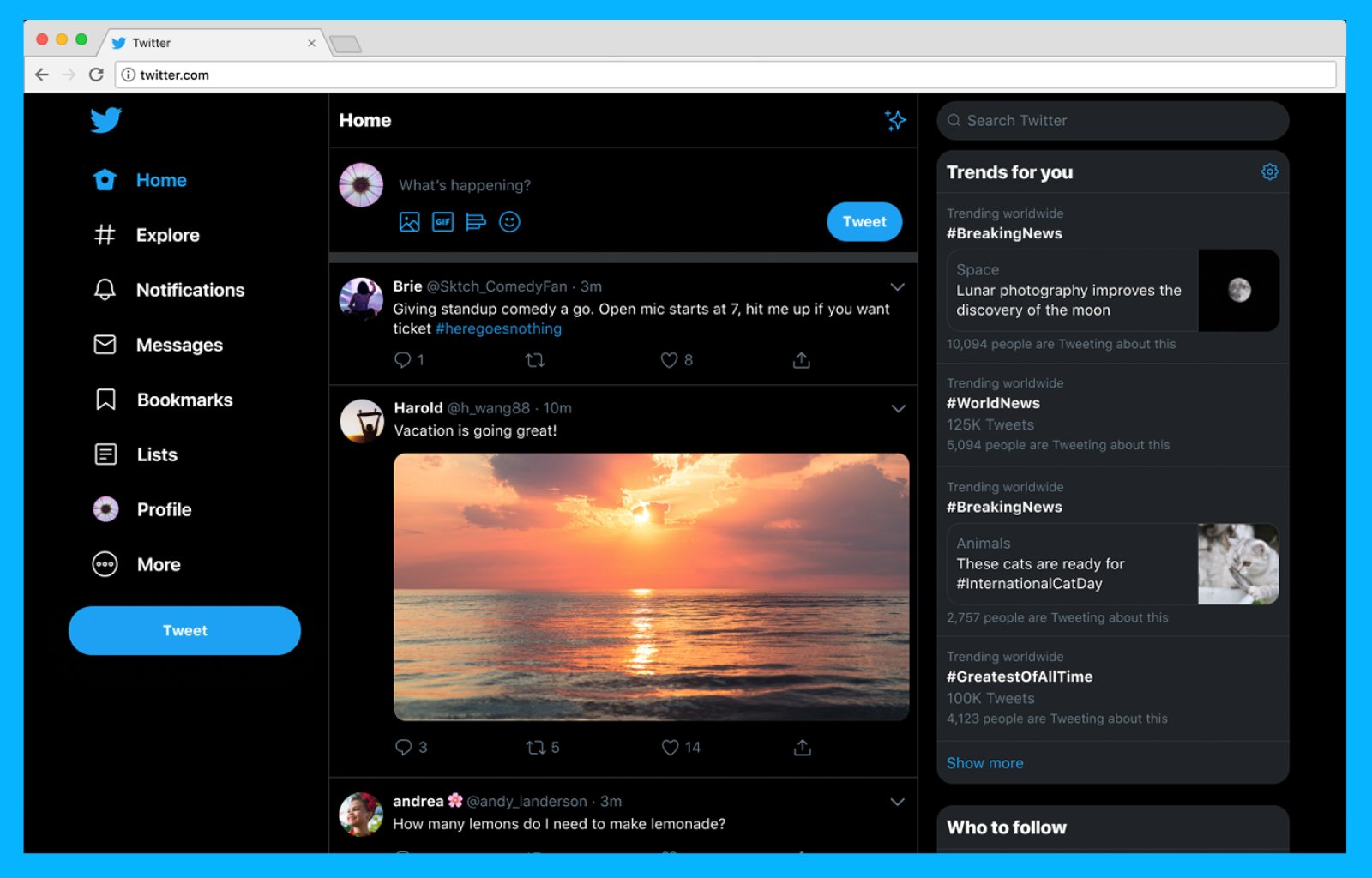
“Today, we are starting to roll out a new Twitter.com — a refreshed and updated website that is faster, easier to navigate and more personalized,” reads the press release. “The site has an updated look and feel that is more consistent with the Twitter you see on other devices, making it easier to access some of your favorite features, and with more options to make it your own.”
The changes are as follows, according to Twitter:
- More of What’s Happening: “We’ve brought over Explore to bring you the same great content found in our apps; expect more live video and local moments personalized for wherever you are in the world. Get context with profile information within conversations and check out your Top Trends in any view so you never miss what’s happening.”
- Easy access to your favorite features: “Bookmarks, Lists, and your Profile are right up front and have their own spot on the side navigation, making it easier and faster to jump between different tabs.”
- Direct messages all in one place: “Direct Messages have been expanded so you can see your conversations and send messages all from the same view. Now there’s less hassle switching between screens to send a message.”
- Login, logout struggle no more: “Whether you have one profile or a few, now you’re also able to switch between accounts faster, directly from the side navigation; your stan, foodie and cat meme accounts thank you.”
- Make Twitter yours: “The love is real for dark mode themes Dim and Lights Out. You’ve asked for even more ways to personalize Twitter so we’re bringing you different themes and color options, along with two options for dark mode.”
There are a few key differences in the redesigned Twitter website. The top navigation bar is gone, so the entire menu is now stacked in the left-hand column — including bookmarks and lists, two useful curation functions that were previously either hidden or unavailable on the website.
Trending hashtags now top the right-hand column, providing a glimpse at the day’s biggest discussion points. Both direct messages and expanded single tweets now have their own dedicated pages, meaning there are fewer overlays around the site.
The new experience is not only faster in terms of performance, but it will also allow Twitter to introduce new features faster than before. It’s rolling out today, so it’ll make its way to your browser soon.
Woah, what’s this? A shiny new https://t.co/q4wnE46fGs for desktop? Yup. IT’S HERE. pic.twitter.com/8y4TMzqBGa
— Twitter (@Twitter) July 15, 2019

