A Closer Look at ‘The Art of the iOS Icon’ [PICS]
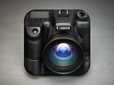
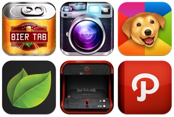
When we see applications in the App Store, sometimes we tend to overlook the intricacies of app icons. Probably because they are relatively small on the iPhone, but when viewed in a larger resolution you can then start to see some incredible details.
Over at Mobile Inc., Murat shows us how developers should invest in a well-designed icon and previews some pretty detailed and impressive icons. One of his favourites include the icon for the Canadian fitness app Physique, which we previewed a while back.
To check out a massive gallery of iOS icons in various resolutions (57×57 all the way to 512×512 pixels), visit iicns.com.
What are some of your favourite iOS app icons?
Want to see more of our stories on Google?

P.S. Want to keep this site truly independent? Support us by buying us a beer, treating us to a coffee, or shopping through Amazon here. Links in this post are affiliate links, so we earn a tiny commission at no charge to you. Thanks for supporting independent Canadian media!


