Google Maps Undergoes Partial Redesign, Adapting to User
Google announced in an update that its Maps platform underwent a partial redesign that aims to make it quicker and easier for users to find places depending on their usage.

The bright new look, unveiled on Wednesday, is supposed to reflect “your world, right now,” according to Liz Hunt, product manager of Google Maps.
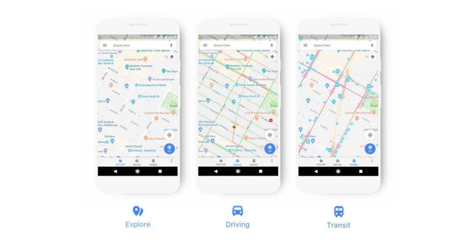
With the update, Google Maps will subtly change based on what you’re doing. If you’re using navigation, for example, the app will highlight locations you’re more likely to need while driving, like gas stations. Likewise, if you’re looking at transit directions, Maps will point to bus stops and public transportation stops.

“Places like a cafe, church, museum or hospital will have a designated color and icon, so that it’s easy to find that type of destination on the map,” Hunt wrote. “For example, if you’re in a new neighborhood and searching for a coffee shop, you could open the map to find the nearest orange icon (which is the color for food/drink spots).”
Google Maps is also getting a new color scheme for points of interest. Shopping POI’s will now be blue, Entertainment and Leisure POI’s will be a teal color, Health POI’s (like hospitals) will be a red/pink color. To go with the new POI color schemes are dozens of new icons for various places from aquariums to churches to schools.
The changes are being rolled out to all the relevant Google products over the coming weeks, including not only Maps but also Google Assistant, Search, Earth, and Android Auto.
Want to see more of our stories on Google?

P.S. Want to keep this site truly independent? Support us by buying us a beer, treating us to a coffee, or shopping through Amazon here. Links in this post are affiliate links, so we earn a tiny commission at no charge to you. Thanks for supporting independent Canadian media!

